For years, designers started with desktop versions and then figured out how to squeeze everything onto mobile screens. This approach seemed logical—more space means more possibilities, right?
Turns out, working backward creates more problems than it solves. Elements that work beautifully on a large screen become awkward or unusable on phones. Navigation systems collapse ungracefully. Features that seemed essential become impossible to fit. The mobile experience becomes an afterthought.
Mobile first flips this entirely. Start with the smallest screen, nail that experience, then enhance for larger screens. What seems limiting actually forces better design decisions.
Why Mobile First Makes Sense Now
The "mobile first" concept isn't new, but the case for it has strengthened considerably:
Traffic reality. Over half of web traffic globally comes from mobile devices. For many businesses, mobile is 60-70% or more. Designing for the minority usage (desktop) before the majority doesn't make sense.
Google's indexing. Google now uses mobile-first indexing. They evaluate the mobile version of your site for rankings. Desktop is secondary. If your mobile experience is weak, your search visibility suffers regardless of how good desktop looks.
User expectations. People expect mobile experiences to work well. They're not impressed by a responsive site that technically functions on mobile but clearly wasn't designed for it.
Constraint breeds clarity. Limited screen space forces you to prioritize what actually matters. You can't include everything, so you must decide what's essential. These decisions benefit the experience on all screen sizes.
The Core Philosophy
Mobile first isn't just about technical implementation—it's a design philosophy.
Content priority. What information is absolutely essential? Mobile's limited space makes you answer this question honestly. On desktop, you can include nice-to-haves and secondary information liberally. Mobile doesn't allow that luxury.
Progressive enhancement. Start with core functionality that works everywhere. Add enhancements for devices that support them. Rather than building everything and then removing features for mobile, you build the foundation and add layers upward.
Performance by default. Mobile designs tend to be lighter. Fewer images, simpler layouts, less JavaScript. This performance benefit carries through to larger screens too.
Touch-first interaction. Mobile interaction is fundamentally different from desktop. Fingers aren't as precise as mouse cursors. Touch targets need adequate size. Hover states don't exist. Designing for touch first ensures those basics are right.

What Changes When You Design Mobile First
Concrete differences in approach:
Navigation Becomes Essential, Not Elaborate
Desktop sites often have mega menus, multiple navigation levels, dropdowns on hover, sidebar navigation, footer navigation—many ways to move around. On mobile, you typically get one hamburger menu or bottom navigation bar.
This forces you to organize information architecture clearly. If your site genuinely needs seventeen top-level navigation items, something's probably wrong with your information structure.
Mobile first reveals these issues early. You solve them at the architecture level rather than hiding them behind elaborate navigation systems.
Content Gets Prioritized Ruthlessly
On a 1920px-wide screen, you can have three-column layouts with sidebars full of secondary content, related links, advertisements, and promotional boxes.
On a 375px-wide screen, everything is single column, linear, and sequential. Visitors scroll through content in order. The sidebar goes below main content—or gets hidden entirely.
This forces questions:
- What's the single most important thing on this page?
- What do users actually need versus what we want to show them?
- Does this secondary content justify its existence?
Often, the "secondary" content you're tempted to stuff into sidebars isn't necessary at all.
Performance Gets Built In
Mobile designs naturally tend toward:
- Fewer background images
- Smaller image assets (because screens are smaller)
- Simpler animations (battery life matters)
- Less JavaScript (mobile processors are weaker)
- Faster load priorities
When you enhance for desktop, you're adding performance overhead rather than trying to reduce it. The baseline is lean.
Interaction Design Gets Honest
Mouse interactions are precise. Hover reveals information. Small click targets are manageable. Multiple items can sit close together.
Touch interactions are imprecise. No hover exists. Tap targets need minimum 44-48 pixel sizes. Spacing matters more.
Designing for touch first means:
- Buttons are adequately sized
- Links have enough spacing
- Interactive elements are obviously interactive
- Form inputs are finger-friendly
These requirements don't hurt desktop users—they make interfaces clearer for everyone.

The Technical Implementation
Mobile first affects how you write CSS and structure your code.
Media Queries Work Upward, Not Downward
Traditional (desktop-first) approach:
.container {
  width: 1200px;
}

@media (max-width: 768px) {
  .container {
    width: 100%;
  }
}
Mobile-first approach:
.container {
  width: 100%;
}

@media (min-width: 768px) {
  .container {
    width: 1200px;
  }
}
The default is mobile. Larger screens get enhanced styles through min-width queries. Simpler CSS, clearer logic.
Base Styles Are Mobile Styles
Your base CSS should work perfectly on mobile without any media queries. Everything you add via media queries is enhancement for larger screens.
This means:
- Single-column layouts by default
- Full-width elements by default
- Linear stacking by default
- Touch-appropriate sizing by default
Media queries then add:
- Multi-column layouts at appropriate breakpoints
- Sidebars for larger screens
- Expanded navigation
- Larger typography (if appropriate)
- Additional visual elements
Breakpoints Based on Content, Not Devices
Rather than using "tablet" and "desktop" breakpoints based on popular device sizes, let content dictate breakpoints.
Watch where your layout breaks. When a line of text becomes too long for comfortable reading, add a breakpoint. When a single-column layout has too much whitespace, add columns. When touch targets would be too small, stop there.
This results in more natural transitions and fewer arbitrary points where layouts shift awkwardly.
Common Mistakes to Avoid
Hiding Content on Mobile
Don't use display: none to hide desktop content on mobile. This often means the mobile experience is incomplete—you're just hiding the shortcomings rather than solving them.
If content isn't needed on mobile, ask whether it's needed on desktop either. If it is genuinely needed only on larger screens, make sure mobile users don't lose important functionality.
Ignoring Touch After Design Phase
Designers often forget about touch during implementation. Specifications show 32px buttons that look clean in mockups but are frustrating to tap in reality.
Test designs with actual fingers on actual devices throughout the process.
Over-Minimizing for Mobile
Minimalism is good, but functionality shouldn't suffer. Some mobile designs strip away so much that users can't accomplish basic tasks. They have to switch to desktop to access features.
Mobile first means prioritizing, not abandoning. Core functionality must be present and usable.
Single-Breakpoint Responsive
Some sites are essentially two designs: "mobile" and "desktop." The experience jumps between them with nothing in between.
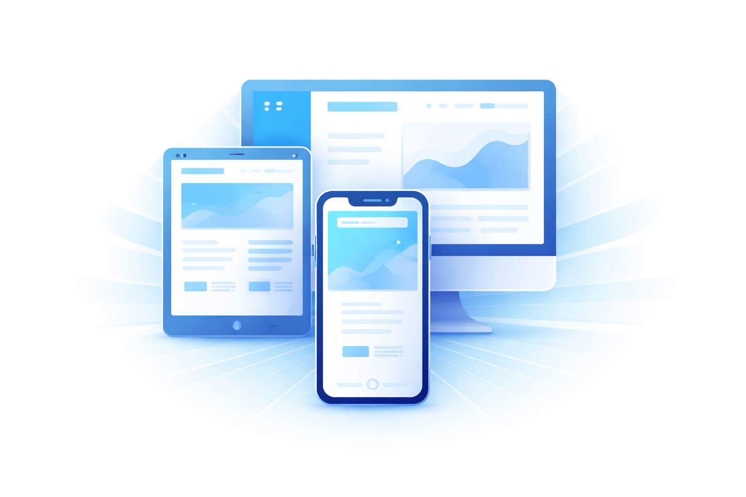
Tablets, large phones, small laptops, and various window sizes exist. The experience should adapt gracefully across the entire range, not just at two endpoints.
Organizational Challenges
Mobile first isn't just a technical change—it's a workflow change.
Stakeholder Expectations
Decision-makers often review designs on desktop monitors. They're used to desktop-first presentations. Showing mobile designs first can feel backwards to them.
Set expectations early. Explain why you're presenting mobile first. Show how the design expands for larger screens. Help stakeholders understand they're seeing the foundation, not a limited version.
Design Tool Workflows
Design tools default to artboard sizes that suggest desktop first. Designers are used to working on larger canvases.
Consciously start new projects with mobile artboards. Expand from there.
Content Creation
Content teams often write for desktop reading experiences. Long paragraphs, wide tables, embedded media that assumes large viewports.
Content strategy needs to account for mobile consumption. Shorter paragraphs, scannable formatting, media that adapts appropriately.
Progressive Enhancement in Practice
Mobile first enables true progressive enhancement:
Layer 1: Core content and functionality. Works on any device, any connection. The essential experience.
Layer 2: Enhanced layout. Multi-column layouts, expanded navigation, additional visual elements for larger screens.
Layer 3: Rich interaction. Animations, hover states, advanced features for capable browsers.
Each layer builds on the previous. Users with basic devices get a complete (if simple) experience. Users with modern desktop browsers get a rich experience. Nobody gets a broken experience.
Benefits Beyond Mobile
Mobile first improves experiences across all devices:
Cleaner desktop designs. The ruthless prioritization required for mobile carries through. Desktop designs end up less cluttered, more focused.
Better performance everywhere. The lean foundation benefits all users, including desktop users on slow connections.
Easier maintenance. Building up from simple to complex creates cleaner, more maintainable code than retrofitting complex designs for simple contexts.
Accessibility improvements. Touch-friendly design and content prioritization benefit keyboard users and screen reader users too.
Getting Started
If you're new to mobile first:
-
Resize your browser constantly. Develop the habit of checking small screens throughout the design process.
-
Design on mobile artboards first. Before touching desktop sizes, solve the mobile design.
-
Write base CSS for mobile. Then add min-width queries for enhancements.
-
Test on real devices. Simulators help, but real phones reveal real issues.
-
Challenge every element. "Is this truly needed on mobile?" If no, does desktop really need it either?
Mobile first isn't about limiting experiences—it's about building better foundations that enhance gracefully across all devices.
Need help creating a mobile-first website? Duo Dev Technologies designs and develops responsive websites that work beautifully across all devices. Get in touch to discuss your project.