Your landing page has one job: convert visitors into customers. Or at least into leads.
It's the first real impression of your product. Get it wrong, and potential customers leave before understanding what you offer. Get it right, and your marketing starts paying for itself.
Most SaaS landing pages fail not because the product is bad, but because the page doesn't communicate value effectively. Let's fix that.
What Makes a Landing Page Work
Before tactics, understand the psychology:
Visitors arrive with questions:
- What is this?
- Is it for me?
- What problem does it solve?
- Why should I trust this?
- What do I do next?
Your landing page must answer each question in order. Miss one, and they're gone.
The 5-Second Test
Visitors decide within 5 seconds whether to stay or leave. In that time, can they understand:
- What your product does
- Who it's for
- Why it matters
If not, everything else is irrelevant—they've already bounced.
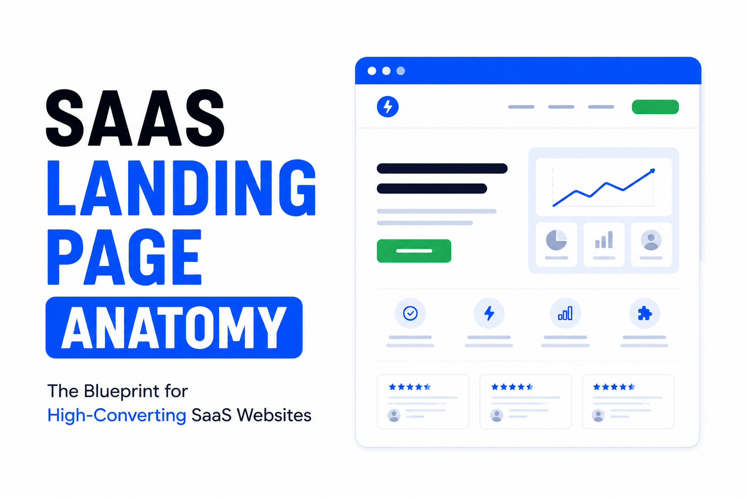
The Hero Section: Your First (and Maybe Last) Impression
The hero section is prime real estate. Everything above the fold must earn the scroll.
Headline Principles
Your headline should communicate:
- What you do
- Who it's for
- The primary benefit
Weak headline:
"The Next Generation Solution for Modern Teams"
Problem: Says nothing. Could be any product.
Strong headline:
"Project Management That Doesn't Suck: Get Your Team Aligned in Minutes"
Works because: Specific, emotional, speaks to pain point.
Headline formula that works:[Result/Benefit] + [Timeframe] + [Without common objection]
Examples:
- "Send invoices that get paid 2x faster"
- "Build websites without writing code"
- "Track expenses in 30 seconds—no spreadsheets"
Subheadline
Expand on the headline with more detail:
Headline: "Email Marketing That Actually Converts"
Subheadline: "Create beautiful campaigns in minutes, segment your audience automatically, and watch engagement soar—without a marketing degree."
The subheadline handles objections and adds specificity.
Hero CTA
One clear call-to-action. Not three. One.
Weak:
- Sign Up
- Learn More
- Watch Demo
- Contact Sales
Problem: Decision paralysis. Too many options.
Strong:
- Start Free Trial
- Get Started Free
- Try [Product] Free
The CTA should promise a next step, not a commitment.

Communicating Value
After the hero, prove your claims.
Features vs. Benefits
Features describe what your product does. Benefits describe what customers get.
| Feature | Benefit |
|---|---|
| Real-time sync | Never work with outdated data |
| AI-powered analysis | Get insights without being a data scientist |
| Mobile app | Work from anywhere |
| 256-bit encryption | Sleep well knowing your data is safe |
Lead with benefits. Support with features.
The 3-5 Key Benefits
Don't list 20 features. Highlight 3-5 that matter most.
Structure each benefit:
- Icon or visual
- Short, benefit-focused headline
- 1-2 sentence explanation
- (Optional) Supporting data or proof
Too many benefits overwhelm. Focus on what differentiates you.
Problem → Solution Narrative
Frame features around problems:
The Problem: You waste hours manually entering data into spreadsheets.
The Solution: Our automatic import pulls data from 50+ sources and organizes it instantly.
This creates emotional connection. Visitors recognize themselves.
Social Proof: Building Trust
Nobody wants to be the first customer. Show that others trust you.
Types of Social Proof
Logos:
Display recognizable customer logos. "Trusted by Stripe, Shopify, and 500+ growing companies."
Testimonials:
Quotes from real customers, ideally with photo and company name.
Case Studies:
Detailed success stories with specific metrics.
Numbers:
"50,000+ teams use [Product]" or "Saved customers $10M+ last year"
Ratings:
G2, Capterra, App Store ratings.
Making Testimonials Effective
Bad testimonial:
"Great product! Love it!" — John
Good testimonial:
"We cut our onboarding time from 2 weeks to 3 days. The ROI was obvious within the first month." — Sarah Chen, VP Operations, TechCorp
Specific results > vague praise.
Placement Matters
Social proof should appear:
- Near the hero (logos or quick stats)
- After presenting features (testimonials that validate)
- Before the final CTA (reduce hesitation)
Pricing Transparency
Most SaaS visitors want to know pricing early. Hiding it loses trust.
Pricing Page Best Practices
Clear tier differentiation:
- Each tier has a clear "who this is for"
- Feature differences are obvious
- One tier is highlighted as "Most Popular"
Anchor pricing:
Show a higher tier first to make other tiers seem reasonable.
Annual discounts:
Offer annual pricing with visible savings.
Free trial or freemium:
Reduce risk. Let people try before committing.
Handle Pricing Objections
Address common concerns near pricing:
- Money-back guarantee
- No credit card required for trial
- Easy cancellation
- ROI calculator

Call-to-Action Optimization
Your CTA is where conversion happens—or doesn't.
CTA Button Best Practices
Visibility:
- High contrast color (stands out from page)
- Large enough to tap on mobile
- White space around it
Copy:
- Action-oriented ("Start Free Trial" not "Submit")
- First-person can work ("Start My Free Trial")
- Include value ("Get Started Free")
Reduce friction:
- "No credit card required"
- "Free forever for small teams"
- "Set up in 2 minutes"
CTA Placement
Primary CTA locations:
- Hero section (immediate action)
- After value proposition (now they understand)
- End of page (for scrollers)
- Sticky header/footer (always accessible)
Don't hide your CTA. Don't make visitors hunt for how to convert.
Design That Converts
Visual Hierarchy
Guide attention deliberately:
- Largest elements = most important
- Eyes flow top-to-bottom, left-to-right
- Whitespace creates focus
- Contrast draws attention
If everything is bold, nothing is bold.
Mobile Optimization
Over 50% of traffic is mobile. Your landing page must:
- Load fast (3 seconds or less)
- Have readable text without zooming
- Have tappable buttons (min 44px)
- Simplify navigation
- Work without hover states
Test on actual devices, not just browser resize.
Page Speed
Slow pages kill conversions. Every second of delay = lower conversion.
Optimize:
- Compress images (use ToolByte Image Compressor)
- Minify CSS/JS
- Lazy load below-fold content
- Use CDN
- Minimize third-party scripts
Reduce Cognitive Load
Simple pages convert better.
- One offer per page
- Limited navigation (or none)
- Clear visual path
- Minimal distractions
- Focused content
Every element should serve the conversion goal.
A/B Testing Strategy
Don't guess—test.
What to Test
High impact:
- Headlines
- Hero image/video
- CTA copy and color
- Pricing presentation
- Social proof placement
Medium impact:
- Subheadlines
- Feature descriptions
- Testimonial selection
- Form fields
Testing Process
- Identify hypothesis ("Headline A will convert better because X")
- Run test with sufficient traffic (aim for statistical significance)
- Measure conversion impact
- Implement winner
- Test next element
One change at a time. Otherwise, you won't know what worked.
Tools for Testing
- Google Optimize (free)
- Optimizely
- VWO
- Unbounce
Start with headline and CTA tests—highest leverage changes.
Common Landing Page Mistakes
Too Much Jargon
"Leverage AI-powered synergies to optimize cross-functional workflows."
Nobody knows what that means. Speak human.
No Clear Value Proposition
If visitors can't explain what you do after 10 seconds, you've failed.
Buried CTA
Making visitors scroll forever to find how to sign up loses conversions.
No Social Proof
Claims without evidence are just marketing. Prove it.
Feature Overload
Listing 50 features overwhelms. Focus on what matters most.
Slow Load Time
Performance is UX. Slow pages = lost visitors.
Landing Page Checklist
Before launching:
Above the Fold
- Clear headline communicating value
- Subheadline expanding on benefit
- Relevant hero image/video
- Prominent CTA button
- Trust elements (logos, stats)
Content
- Benefits > features
- Social proof throughout
- Objection handling
- Clear pricing
- Multiple CTAs
Design
- Mobile responsive
- Fast loading (< 3 seconds)
- Clear visual hierarchy
- Consistent branding
Conversion
- Single clear goal
- Low-friction CTA
- Trust signals near conversion points
- Form is minimal (if applicable)
Continuous Improvement
Landing pages are never done. Establish a rhythm:
- Monthly: Review analytics (bounce rate, conversion rate, scroll depth)
- Quarterly: Major test (headline, hero, pricing)
- Ongoing: Collect customer feedback about messaging
Your landing page should evolve as you learn more about what resonates with customers.
Need help optimizing your SaaS landing page? Contact Duo Dev for conversion-focused web design and development.